Design, etc
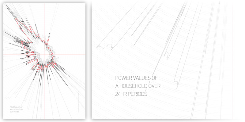
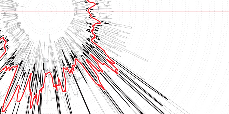
This poster displays the power values of a household, taken at one minute intervals, repeatedly plotted over a 24 hour cycle. By displaying this normally dry data in a form that emphasises and illuminates otherwise hidden features, it allows stories to be both told and imagined, and our own behaviour better understood. That spike at 3am - when the graph is read like a 24hr clock - was a one-off nighttime cup of tea... can boiling the kettle just once really use so much energy? That consistent peak must be dinner time. And is that wave, visible at night, the fridge on its cycle - running all day every day?
The polar graph is based on a static dataset of per-minute power readings over four consecutive 24 hour periods - 1440 data points per day. The light grey lines are individual datasets; black is an average of the four days combined. The red is a smoothed average, showing broader usage patterns than the fine-grained data, with its many fine peaks, can show.
This poster was created during a course on computational design at CIID in 2009, exploring the potential of code in a design context, co-taught by Patrick Kochlik and Dennis Paul of Berlin-based The Product. Running for two weeks, with the programming language and environment Processing the primary tool of choice, the course assumed no prior programming knowledge, and culminated in an exhibition of both posters and interactive works that were produced by the students.
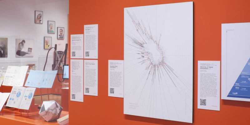
It was shown in the exibition 'Talk To Me' at the Museum of Modern Art, New York, in 2011.